
In Bill Watterson’s inventive world of Calvin and Hobbes, sudden change and contrast of situations in such states of mind, are the basis for fantasy and brilliant comedy.
“If there is a single key ingredient in good design it would have to do with variety.” — Fritz Henning, Illustrator.
Without variation (i.e. change/contrast), no idea can be presented, for everything you see or feel is relative to what’s around it, both in time and space.

This common optical illusion shows what happens to your eyes when variation of tones occur. Here the simple grid pattern of surrounding grey and black lead you to see black dots in the white circles, where there are none. (squint your eyes for objectivity)
Something small is only so next to something bigger, nothing looks fast unless it’s compared to something slower or stationary. The most subtle smile looks vibrant next to a sad face, a mid-tone grey looks very dark next to white, and vice versa.
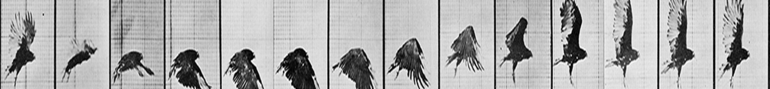
The basics of variation and change come from life — things either grow or deteriorate (or die!) Everything is transient; the future is soon the present, and the present very quickly becomes the past. In life, that concept can be immeasurably challenging, but in art, it grounds the work.


Every cat looks big next to a normal Tweety Bird, not such much next to a potion-induced one. Directed by of Fritz Freleng, these Dr. Jekyll-Mr.Hyde episodes of Sylvester and Tweety are especially memorable due its brilliant use of change and contrast.
Therefore, as artists, you must watch how you present your ideas as things read very differently depending on surrounding shapes, movements, colors and moods. If you change/introduce something, know that the previous expression will take on an entirely different meaning or impression.

Contrast is everything here in MGM’s cartoon “I Got Stripes.” Director Tex Avery was a master at generating marvelous energy and humor by creating contrast through design, timing, and characterization. No two characters could be more different from each other than the Wolf and Droopy.
On a conceptual level, presenting images/ideas to an audience with the background of a preconceived education or exposure can greatly alter any desired effect. History or culture has a huge impress on the perception of ideas, images or objects.

German Shepherd dogs, for instance, continue to be associated with imperialist regimes throughout the 20th and 21st centuries in places like Africa and the Middle East. Political correctness aside, memories die hard.

The Littlest Hobo, a low budget tv show about a gentle yet heroic stray German Sheppard, was very popular in my home country, gracing the family rooms of many Canadian families throughout the 1970’s — 1980’s.
Sometimes, even common primary colors like red and white can have opposite meanings depending on when and where it’s used. In the west, red is associated with blood and danger, where as white is considered pure and virginal. In Asia, the color red is celebratory, displayed abundantly at anniversaries or weddings, while white is used at funerals, or to depict ghosts and demons on stage and in film.

A gorgeous, yet frightening “white” image of the ghost, in Masaki Kobayashi’s beautifully directed 1964 supernatural anthology, Kwaidon. The film represents the director’s nod to Japanese Noh theater, where drama is presented in ominous silence allowing imagery and subtle movement to denote powerful ideas and emotion.

“All my sins have been washed away!” says Delmar after he’s baptized in O’ Brother Where Art Thou, the comedic retelling of Homer’s Odyssey by Joel and Ethan Coen. Here, white symbolizes the purity of heaven and ever-lasting life.
This of course, makes planning and research absolutely necessary. So select your choices carefully, explore and test things out and then show your work. Feedback is paramount to whether things read or not.


Elegantly simple and almost geometrically flat shapes play beautifully against the richly decorative organic backgrounds giving the surrounding world depth and richness, while presenting the characters with purity and distinction. This prominent production design, by Eyvind Earle, makes Walt Disney’s Sleepy Beauty one of the most graphically distinct films in animation history.
Things to consider:
shapes (organic vs geometric)
size (big vs small)
Rhythm (even vs irregular)
color (cool vs warms, vibrant vs muted)
weight (heavy vs lite)
timing (fast vs slow)
depth (graphic vs dimensional)
texture (busy vs quiet)
mood (positive vs negative)
The clear domination of one particular direction over the other, will help dictate the impression you wish to give. Evenly placed elements can offset each other and create confusion or boredom (as discussed here). The audience always prefers a distinct idea, and in film/animation, where time progresses, there’s only a limited opportunity to impress. One can ill afford to let the dog wander off the leash so to speak. You’ve got to take it on a fun, varied ride.
Excellent choreography and sharp execution of shapes and timing, make this moment the scene stealer in Pixar’s Finding Nemo. Animator Doug Sweetland takes you on a marvelous ride, carrying you from one moment of visual joy to another, expressing one distinctive change after another.
Therefore, use change and contrast to set up or deliver the idea. Then present it with absolute clarity, without excessive complexity or diversion. Your audience will love you for it.
“Nothing is pleasant that is not spiced with variety.” — Francis Bacon