
The Zen symbol for wholeness, emptiness and balance.
In the words of spiritual sage and author, Thomas Merton:
“Happiness is not a matter of intensity but of balance, order, rhythm and harmony.”
These words ring so true don’t they? Balance is the ever elusive goal for many of us. Without balance, things look disjointed, off-kilter, and disharmonious. It’s tough to do or sustain in life, and almost as tricky to achieve in art, that is, without making things completely symmetrical and boring.
 A comparison of shape geometry, placement and rhythm. Which is more interesting to you?
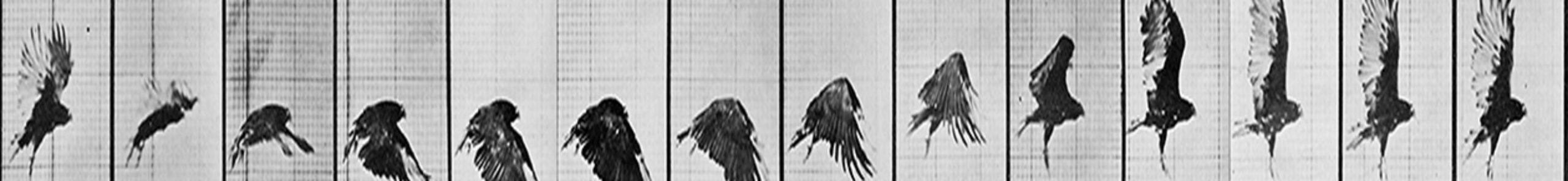
Balance can be easily achieved with symmetry or evenness, but that is neither effective or desirable. In animation, we refer to it as twinning but in entertainment circles, we call it uninteresting. Therefore, the creative individual is constantly challenged to find balance in their work without uniformity, which is, unfortunately, inherent in our age of digital technology. It’s the default setting — whether we’re talking about poses, timing, negative shapes, depth or lighting.

Most rigs, like this free one from Anim School, usually come in the form of a default T-Pose. Everything you get for free is even-steven.
But there are general artistic guidelines to help achieve this elusive goal. If the work is good, evenness is avoided, while balance is achieved —allowing for contrast, texture, and ultimately, greater interest — like in this example by Milt Kahl:


Milt Kahl’s beautiful staging, from Disney’s The Sword in the Stone, demonstrates great depth (using overlap and foreshortening), asymmetrical balance, point of focus and absolute clarity.
Almost all films are structured in three acts, rather than an even four. Syd Field’s three act paradigm chart, is pretty much the standard for not just Hollywood but almost the entire film-making world.

Great balance is needed not just in cinematic design but in every aspect of all artistic compositions, both visually and rhythmically. Whether you’re breaking down a piece of dialogue/story/layout, components must have ebb and flows between them, changes and surprises that make it interesting. It’s why divisions on thirds, or fifths work so well in screen composition:

David Lean’s epic film, Lawrence of Arabia, abides perfectly to the concept of dividing the screen into thirds, while giving the image balance, movement and beauty.
In both music and dialogue, there are ebbs and flows throughout. Good audio design gives a scene texture to work with.

Simple Dialogue breakdown to determine the flow and rhythm of the audio, hi-lighting syllables and rising tone of the recording.
If elements of your work/composition are too evenly spread out, the audience doesn’t know what to do. It doesn’t know where to look, what to focus on. Arrangement of shapes, must be orderly, balanced yet interestingly uneven.

Stanley Kubrick’s use of fifths in his landmark film, 2001: A Space Odyssey. Notice how each division supports the whole.
You also find balance achieved in good character design, where big shapes are complemented by smaller ones, and they are harmoniously integrated within the whole as often seen on character model sheets such as this:

In Stanley Kubrick’s Dr. Strangelove, there are wonderful compositions throughout the film. Although he’s famous for his dominant use of one point perspective and framing on fifths, he also did very intriguing things with perspective, sets and character placement, while still achieving balance:

Does this optical illusion, created by the rabbit-ear telescoping of phone cables created by the mirror and placement of the George C. Scott’s character, imply in some way how much this woman owns him? The boxer shorts, pin up pose and high heels, are a further give away of the clear message sent by the director. From Stanley Kubrick’s 1964 black comedy, Dr. Stranglove.
What’s your main theme? who’s your central character? Change and contrast create interest. Variation gives the work texture and uniqueness. Allowing one area to dominate will give it focus.

Note the dominance of the screen right eye (elegantly placed right at the apex of the golden rectangle) in this gorgeous portrait by John Singer Sargeant.
So, be careful of balance. It must be there, but know that it’s unevenness, change and contrast that help create texture and interest. Only then, do you have a chance of holding on to an audience’s attention.