
Charlie Chaplin is arguably the most iconic of screen actors. He was also likely the hardest working; he was so completely devoted to his craft that he was known to do over 100 takes to get a scene right.
When doing creative work of any kind, it’s so important to get the whole thing right. That means more than simply making one or two aspects of your work successful. The best creative work communicates on multiple levels in order to do its job as art. It’s a cumulation of creative choices, skills and soul.
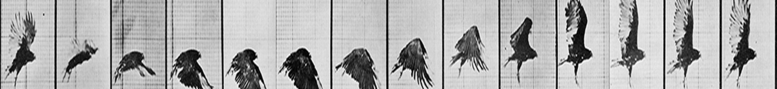
“You owe it to yourself and the medium.” — Milt Kahl
An old art teacher once told me that the style of a painting or sculpture is never the issue when judging its quality. Rather, it had to do with the consistency of its message, choice of technique (or materials) and the overall execution. This all makes sense of course. Inconsistent and convoluted work confuses and conflicts with itself. Good work feels harmonious and presents a complete picture of the intent of the work — the artist’s statement. This is not easy to do.

An image from one of the most charming little sequence of shots from Pixar’s Monster’s Inc. by the wonderful Doug Sweetland. The entire series of poses and movements in the compilation all perfectly complement the mood and humor of the situation.
When I was animating, I always had a note taped onto my desk that said “ACE your shot.” It was my reminder to be true to my craft and to each individual task specifically.
A — Appropriateness
C — Clarity
E — Expression
Let’s briefly discuss what this all means:
APPROPRIATENESS: (Is it the right choice?)
Perhaps the hardest thing to do in art is deciding on what to do and how to do it. What’s the idea that’s being presented and how do we make the right story, acting, design and technical choices that would best suit the demands of the work that sits in front of us.
If it’s character animation, what’s the context of the shot we’re animating? What’s the subtext? If it’s a single painterly or illustrative design then what’s the aim of the composition? What colors, lines and shapes should be employed? From determining who the character is to what mood must be conveyed — these issues affect everything we do moving forward. And the shopping list of creative concerns is hefty: composition, choreography, overall shape, contrast, texture, style of movement, amount of movement, etc. Each of these areas requires serious contemplation, research and exploration. Many ideas and options need to be investigated and tested before settling in on a single, firm and final decision, one which can propel us in the best direction. If we don’t have the idea right, we’re gonna waste a lot of time doing, re-doing, and then finally scrapping our work altogether. Without solid planning and preparation we can be running hard and fast and end up no further than where we started. Pretty animation using the wrong acting choices impresses no one. Efficiency does NOT equal effectiveness.
This early stage rough animation by James Baxter of Rafiki from The Lion King shows the kind of thinking and creativity involved right from the beginning. Making great acting choices is what everything else in an animator’s work hangs onto. It’s the life line of the shot.
CLARITY: (Does it work?)
Clarity is essential if we hope to have any sort of solid and understandable presentation of our ideas. It’s the test of our knowledge of both the craft and the task at hand, aswell as our skill in execution. This may be on the graphic or technical/mechanical side of things. How the work appears in the final stages will determine how believable and presentable our work is. What shapes, colors and designs we employ will determine the visual exactitude of our work. If failure resides here, our work will look messy, ugly and confusing. It’s impossible to relate or like work that we can’t understand or see clearly. Excess and complexity can confuse and/or bore.
“There is not greatness where there is not simplicity, goodness and truth.” — Leo Tolstoy
And, if there’s any doubt in terms of physically believability — that is, if we’re not respecting the laws of reality in the world that our art resides in — then we’ve lost our accountability. If we’re talking animation, there must be believable weight, timing and sense of solidity in the environment. If there isn’t, we must ask why not? Is it a deliberate, creative choice or simply failure in execution? If we’ve dropped the ball, then we’ve screwed up. Don’t ever make up new narratives to justify poor execution of the fundamentals.
This magnificent scene by Milt Kahl shows the kind of clear staging, beautiful posing and perfect execution of weight and timing that makes a scene shine. The standard of care and professionalism in every artistic and technical aspect is almost always evident in every single frame of animation done by this legendary animator. From Disney’s Sword In The Stone.
EXPRESSION: (Does it connect?)
We can have the best ideas and even the most perfect graphic artistry and technique but still fail if we don’t manage to connect to the audience. And given each one of us is different, and there being no accounting for taste, reaching this lofty goal is a challenge for even the best artists. But striving to make work that connects is what we artists live for. We’re social creatures and nothing is more meaningful or gratifying than when we’re understood at the deepest existential levels.
“We thought of our characters as real living beings.” — Ollie Johnston
Great art emanates from the soul. There’s no formula for moving the audience. Creating art that stimulates requires an effort driven by passion and an inspired prescription for personal expression. Sometimes the artist’s feelings can be very strong at the inception of a project but gets distorted and faded by the time of its completion. We must hold onto the idea for a long time in order to sustain and make such honesty and truth come through. And only with practice and discipline can we learn this.
And it’s all worth it. In my opinion, this final expressive element is where appeal, power and wonder lies. That’s what ultimately makes the viewer say “wow.” It’s what endures. People feel deeply, memorably connecting with the work even if they don’t necessarily understand all the logic or effort behind it. It’s this thing that resides first inside the artist that deeply connects. And because we’re all very similar, this connective magic crosses all gender and cultural boundaries, so we see not only the artist, but ourselves in the artist’s work.
Now, while artistic or technical excellence is less meaningful without personal expression, art that fails either conceptually, mechanically or graphically would distract the audience from the essense of the work. In other words, without appropriateness or clarity, internal personal passion stays buried inside. Only when those fundamental elements support and align with the soul can a soulful experience be relayed.
In this scene from the movie Doubt, we witness total unified perfection between two fantastic actresses, Viola Davis and Meryl Streep. The kind of captivating performance delivered here, especially by Davis, is what makes film art so incredibly powerful in its ability to connect.
CONCLUSION:
It’s never easy to “ACE” our work. It requires a strong and passionate will to create, a deep devotion to mastering our craft, and an almost primal obligation for personal expression. On top of that it takes real courage.
“What would life be if we had no courage to attempt anything?”
― Vincent van Gogh


