Looking at Our Own Work

A close up of Pablo Picasso seen here working on his gigantic (over 25 ft long) mural masterpiece, Guernica.

“You could learn more about yourself from studying your own work than by looking at anyone else’s.” — Robert Henri, Artist

To look, and to do so with honesty and clarity, at our own work is one of the trickiest things to do as an artist. With our minds so easily preoccupied with our ambitions and expectations, it is quite difficult to be truly objective in our analysis. We are often “too close” to the work. That said, it is absolutely essential that we do so. Like taking stock with our lives, it is good and proper to periodically see where our work is in its level of clarity and execution as well as where we’re at in terms of our own creative development.

A young James Baxter at work. 2D masters such as Baxter are always periodically flipping their work to see how it plays, before they play it (on film).

Of course, as has been mentioned here before, the most obvious way to get immediate feedback is to get it from other people — colleagues, supervisors, teachers, coaches etc. If we want our work to read to others, and this is most certainly true working in a commercial field or on a project where the work needs to trigger a response from a larger audience, then that is by far the best option (we only have to be mindful that all opinions are biased). However, if the work is more personal, or even innovative, feedback from others isn’t always best or appropriate. Trends and methods come and go in art as they do in everything else in a market economy. Common people, including your typical work colleague, can often have common minds — minds stuck on set ways of seeing. And sometimes, it isn’t even possible to find feedback from others. For a fresher perspective, sometimes we have to look elsewhere or try something else. But the first thing we must do is to stop and move away from the work. Afterwards, we can begin to look to more creative ways to self-critique.

“All truly great thoughts are conceived while walking.” ― Friedrich Nietzsche, Philosopher

Ways of Self-Critique:

Here are some suggestions (and I apologize again making another list but it is the simplest way to present options). Some are more technical while others are more ethereal:

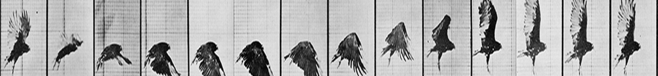
1) Look at your work from a different perspective. Flip the horizontal (or use a mirror). Or look at it from a distance. If you’re an animator, check other camera views: perspective, side, front and top views. Consider changing the lighting/rendering to silhouete or toon shade option. Flaws in work are often revealed this way with striking obviousness.

2) Look at it as if it’s not yours. Does it make any sense if you didn’t know the vision, story or ideas involved? Never forget that your default state is that you know what it’s about and that this knowledge blinds you to seeing the truth. Breakdown aspects of it and critique that element exclusively and objectively as possible. For example, if animating dialogue, take the sound away and just look at the images and movement. Does the acting still read?

3) Go thru the checklists. Does it meet your goals and all the requirements you need to make it work? Does it hit all the director’s notes/concerns? Did you ACE the shot? And what about the flaws? Has the checklist of errors — and you should always make one for each shot — been addressed?

4) Compare your work to something similar (in style or idea) that is really good. How does your work hold up next to it? How does it compare to that of your colleagues who consistently do good work? Consider also comparing it to the works of old masters. This has been a time-tested method for artists who would become new masters in their own era. When I joined the 3D animation world, there were few if any established 3D animators of note. Besides pushing each other, me and most of my colleagues had to compare our work with the higher standards of long-established classical 2D masters. Time-tested art is often far superior to that of contemporary work and trendy tastes.

5) Compare your work to your older work. When it comes to development, nothing is as important. There should be marked improvement. If there hasn’t been, again, ask why? When this happens, the problems are usually more deep-seated and possibly environment-induced — seek professional coaching advice if so. Bad thinking not only inhibits growth, it can reverse it. Otherwise, if you’re better today than you were yesterday, you’re off to a good start.

Conclusion:

It’s important to self-assess. To do good art requires honest reflection on the work and ourselves personally. It’s not about ambition or even about getting better. It’s far simpler than that. It’s the acknowledgement of the present, where we are and where our art stands. If we make mistakes and learn from them, it’s a good day. Then we move on to the next piece, idea or dream. We keep working.

“Life can only be understood backwards; but it must be lived forwards.” ― Søren Kierkegaard, Philosopher

Planes, Points & Pins

“An artist must have imagination. An artist who does not use his imagination is a mechanic.” — Robert Henri, Artist

Art is almost all about seeing (and then creating). Sometimes, our source of inspiration lies outside of ourselves, at other times, they come from within. But all artists must be able to see what’s there in front of them in order to portray their artistic vision with clarity and truth. And when doing figurative work, the ability to understand and use planes, points and pins within the anatomical structure makes the artist’s argument that much more convincing.

Here we’ll look at how different styles of artists make use of such concepts to empower their art:

Planes:

Frank Miller’s legendary art from his masterful Graphic Novel series Sin City.

Frank Miller is renown for his graphic brilliance and bold use of black and white. Aside from fantastic composition skills and a superb use of line and shape, what is not always evident is his absolute control of form in his creations. His dominant light and shadows wrap around the almost invisible forms, creating deceptively flat shapes that live on planes of the body and costume, giving them solidity and texture. The interplay of those angular shapes not only create depth but, more importantly, enable a jagged dance between light and shadow — clearly a metaphor for the interesting world of good and evil that is Sin City.

Rough animation drawing by Glen Keane, from Disney’s Beauty and The Beast.

Master animator Glen Keane caught the attention of the world when his Beast became the prominant creation behind the first ever animated film to be nominated for a Best Picture Oscar. The acting and sheer physical force of the character brought immense feeling to the screen — feeling that even the most novice of animation fans could recognize as unusually powerful. But what always makes Glen’s work so complete (among other things) is his use of planes; they add dimension and presence to his art. Although he’s working only in lines, we can see how the planes of the face, body, legs and arms all line up in a way that plants the character solidly in his own three dimensional space, making the illusion of life completely convincing.

Points:

Francisco de Goya’s Two Old Men Eating Soup is known as part of his “Black Paintings”

Goya’s work is almost always loaded with emotion and story. It was part of his brooding nature and his interest to portray human upheaval, triumph and suffering — he was a true historian of his era. A master draftsman, he controlled his brush as he would a pen, giving immense detail in his creations with the simplest of brush strokes. Here, we can see the astute usage of points — lines of direction created to guide the eye of the spectator. Sometimes, these invisible lines of action lie along the edges of a form, while at other times, they emerge from within it, each with its own role to play. All great artists and filmmakers do this; drawing attention and bringing drama to the composition by aligning forms to create movement and aim. In this particular sketch, one can argue that Goya cheated by doubling up on the finger pointing by his two subjects, although it’s more likely that the parallel imagery is intentional.

“Just Bring You” — one of many paintings done by the legendary illustrator Bernie Fuchs.

A master of composition, color and drawing, Bernie Fuchs was (and still is) an inspiration to artists worldwide. Fuchs’ carefully thought out usage of shapes, both geometric and organic, create images so beautiful it’s hard to take one’s eyes off them; they’re always wonderfully balanced yet never static or even. A strong advocate of triangulation in his work, Fuchs’ compositions constantly moves the eyes from one color, one shape or one line to another. He’s not afraid to contrast other elements too, including light and dark, as well as detailed and open spaces. They all keep you traveling from one spot to the next, giving the eye a playful yet unexpected journey in many different ways and along many different paths.

Pins:

Michelangelo’s priceless studies for the Libyan Sibyl.

There are few artists in the world who have moved the art world as much as Michelangelo Buonarroti. Both his paintings and sculptures define weight and form. His masterful understanding of the human body, in all its details both in construction and mechanics (i.e. function) bring great believability to his art. Looking closely, we see he’s totally aware of both the location and action of the joints and intersections of the body’s bones and muscles; the hips, shoulders, ears and the joints of the arms all have relationships with each other. The annotated “pins” indicate both the angle and direction by which the various body parts aim and how they align. This is something many illustrators and animators today often ignore either due to their negligence (laziness) or lack of knowledge of body construction/mechanics.

Chuck Jones’ sketch of Wile. E. Coyote and the Roadrunner.

We all love Chuck Jones for his comic genius. His work defies convention and brings real intelligence to the mere “cartoon short.” But Jones is an amazing draftsman — arguably one of the best ever to don the duties of an animator. His control of the line as well as the weight in his lines, have formed many wonderful moments of caricature and visual delight. But he, like the other masters listed above, make use of all the planar and directional elements that make his figures appear so full and solid. Here, it’s clear that nothing is ever flat nor even. His respect for the alignment of the solid structures (like the skull and hips) and various joints (like the knees and elbows) helps make everything work in harmony — a perfect marriage between design and anatomical structure (form). This is great animation posing.

Summary:

All great art obeys certain laws. When working with figures, building and using that knowledge relating to the planes, points and pins of human (or animal) anatomy can bring great power and believability to one’s work. We must see thru things and beyond the obvious.

“Every block of stone has a statue inside it and it is the task of the sculptor to discover it. — Michelangelo Buonarroti, Artist