
What is space?
That’s a question that’s not as easy to answer as one would think. Here are some thoughts about space and what it may mean to our work and to our lives as artists:
- in drawing or posing are you aware of the relationships between positive and negative space? Oil painters or weavers, for example, are always aware of the relationship between background and foreground (because they have make/incorporate them in their medium).
- take note of seeing how positive space attracts sharp focus to areas, where as negative space generalizes them.
- take note of how lines manipulate and divide spaces. When you draw a lot, you sharpen this instinct.
- are you merely seeing things graphically in two-dimensional space, like in graphic design, or are you incorporating true three dimensional space, being mindful of perspective, form and volume?
- are you seeing and envisioning movement in 3D space (and not just along a grid of x-y coordinates)?
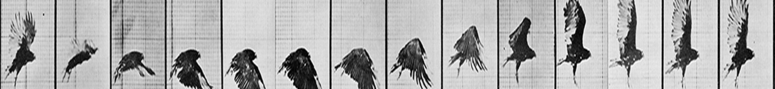
- always remember that spacing is timing in animation because it incorporates both time and distance.
- if you’re struggling with designing your poses, consider using flat or “toon” shade setting. It will simplify your seeing.
- If you leave no space between action — i.e the silence/absence from action — then the actions won’t read.
- remember, space can be both real and illusory; your job as an artist is to use it as a tool for expression.
- do you step back to see the big picture and give space and time for your eyes and mind to see with clarity and not with motivation (i.e. detached from desire or expectations?)
- tight spaces indicate busyness and confined activity where as open spaces indicate freedom and quietude. Vast spaces feel generous, small spaces feel skimpy and trapped.
- the change in the size and characteristic of space around an object will alter the impression of the object’s size and characteristic. I.e. you alter the background, you alter foreground also.
- Is the space in your art inviting or pushing out? Be mindful of the power and importance of composition.
- the vastness of the presentation of space in your work will express the vastness of your message. eg. placing a small single figure in a large open desert both diminishes the significance of the figure and magnifies the power its environment whereas placing a large image of a figure inside a crammed space does the opposite.
- if you want more form, think of the space inside of things.
- if you want more weight, think of the material that sits inside that space inside of things.
- be mindful of how you view and present the world — are you presenting it as an object or subject? eg. in traditional filmwork, cinematography often takes on a “male-oriented gaze”— women viewed as objects to be looked at, men viewed a subjects we can relate to. How you arrange things in space alters our impression of them — above vs below, flat vs dimensional, isolated or in context.
- know that it’s all too easy to see the world in a flat way, especially given the prominance and frequency of interpreting the world through technology, which is always through a glass plane.
- art is all about relationships. Be aware of the happenings between things. Good key poses in animation don’t guarantee good animation, it’s how you handle the frames between them that makes all the difference.
- life is also all about relationships — you with your art, you with your environment, you with other people. How you see and interact with these things defines the quality of your life.
- do you have space between your art and your other relationships? I think it’s important that you do.
- space can serve as silence not just for the eyes but also for the mind. Find more space in your life whenever you can.
- space and time alone is not painful isolation but a gifted opportunity to honestly observe and truly learn about yourself.
- since time and space are intimately linked, they’re needed to see the big picture, it’s always good to periodically take a floodlight focus rather than spotlight focus.
- sometimes the silence of open space allows small detailed spaces to shine.
- notice how nature allows for lots of time and space between things and actions.
- peace, freedom and clarity can only happen when there is space in the mind, when the mind is silent and not pre-occupied with the self and all its desires and fears.
- it may not always be good to think of space as something that seperates objects. Try, perhaps, to think of space as something that connects things rather than separates them.
“Space and silence are necessary to go beyond the limitations of consciousness.” — J. Krishnamurti”


